CONCRETE 2.0 & AD MANAGER
Using a product rebuild to mature system infrastructure across six applications
The Problem
GumGum’s Ad Manager was the company’s core revenue-generating platform, a data-heavy, high-complexity operational tool used daily by internal teams. But it was running on a dated 2008 tech stack buried in tech debt. Four additional enterprise applications and five smaller tools all shared data but had wildly inconsistent UX patterns. A company-wide rebrand was happening simultaneously. The challenge: improve the UX/UI with limited backend changes while unifying a fragmented product ecosystem under a single design system.
The Ecosystem
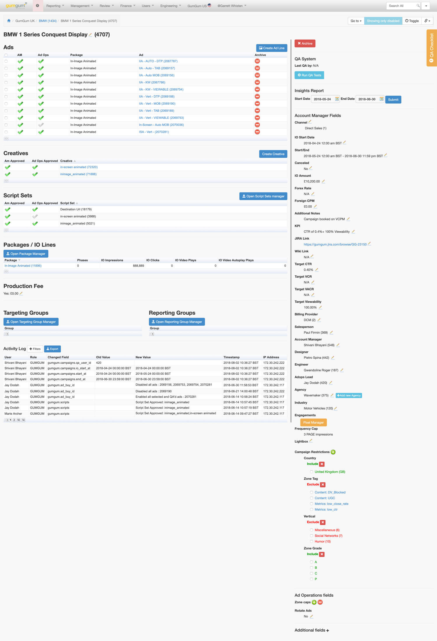
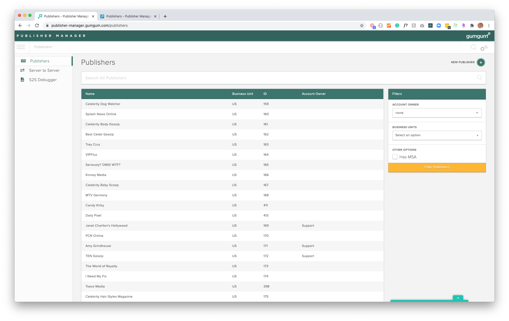
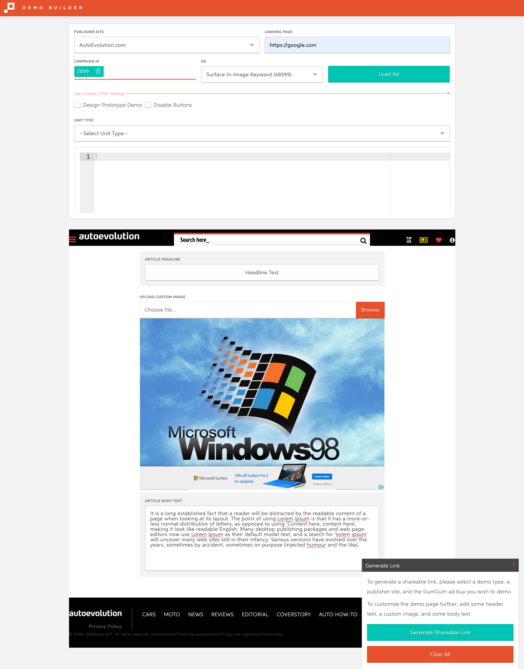
Ad Manager was the revenue backbone, but it never operated alone. Publisher Manager, Demo Manager, Ad Builder, and Demo Builder all hung off the same data with their own conventions, their own table behaviors, and their own interpretations of the brand. Fixing one application in isolation would have just added a seventh dialect. The rebuild had to treat the ecosystem as one product.
The Research
You can’t simplify a workflow you’ve never run yourself.
Before touching a screen, I effectively took the jobs of the people using them. I sat with account managers, ad ops, and sales and then ran their workflows end to end myself: trafficking campaigns, QA-ing creatives, building demos against live publisher pages, chasing down an IO discrepancy the way they would on a Friday afternoon. Role-playing the job at that depth surfaces what interviews never do, the workarounds, the muscle memory, the spreadsheet exported at step four because the tool gave up at step three.
I built personas for every operational role the platform served: account manager, ad ops, strategist, designer, salesperson. Each mapped their daily tasks, the KPIs they were accountable for, and the screens they lived in. Those roles are literally first-class fields in the product, so the personas doubled as a data model review.
Terminology drift was an audit finding, not a nitpick. Labels were standardized to match the vocabulary of the ad industry (IOs, packages, RTB, programmatic, CPM, CTR, viewability) and of the verticals our publishers worked in, from automotive to entertainment. A new hire from another ad platform should be able to map their knowledge one to one.
I shadowed sessions and tracked how work actually happened: clicks per task, where copy/paste rituals appeared, which fields got filled in what order, where people hesitated. Repeated hesitation is a cognitive load signal, and repeated copy/paste is a missing feature wearing a disguise.
All of it fed one psychological principle: make the right action obvious and the wrong action hard. Safe defaults, progressive disclosure for data-heavy views, destructive actions gated behind confirmation, states that cannot be misread. Dummy-proofing is not an insult to users. It is respect for people doing high-stakes revenue work at 5pm with a deadline.
The Audit
I conducted a comprehensive product and design system audit across all applications, documenting every inconsistency, redundancy, and workflow friction point. Every screen was printed, put on a wall, and marked up with the team.
Overused components. Duplicate components solving the same problem. Broken design hierarchy. Inconsistent spacing and typography. UX patterns too complex. Data-heavy UI increasing cognitive load.
Different table behaviors across apps. Different filtering logic. Modal vs drawer inconsistencies. Terminology drift. Inconsistent application of rebrand.
Redundant manual workflows. Copy/paste style data tasks. Overly complex interfaces requiring unnecessary operational headcount.

The Approach
We didn’t just reskin an application.
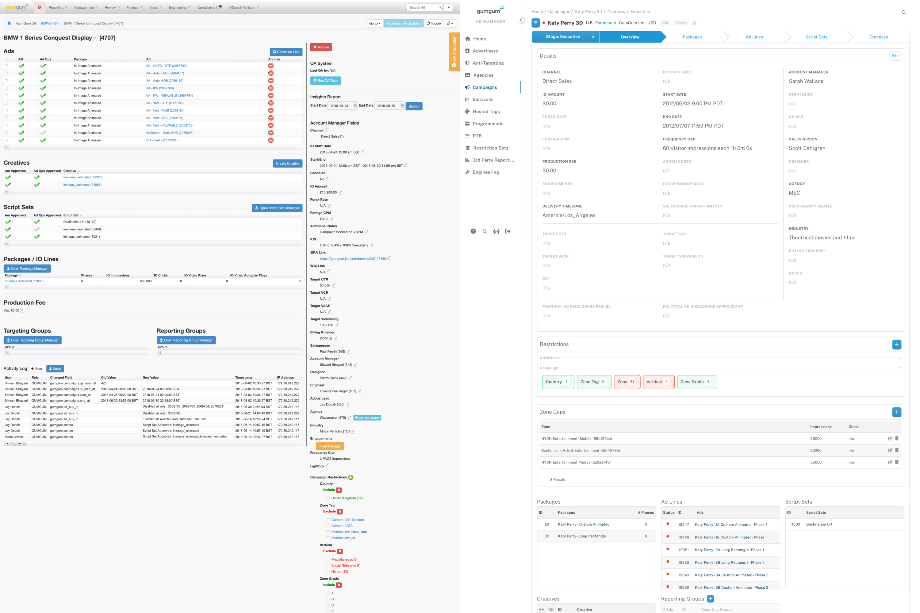
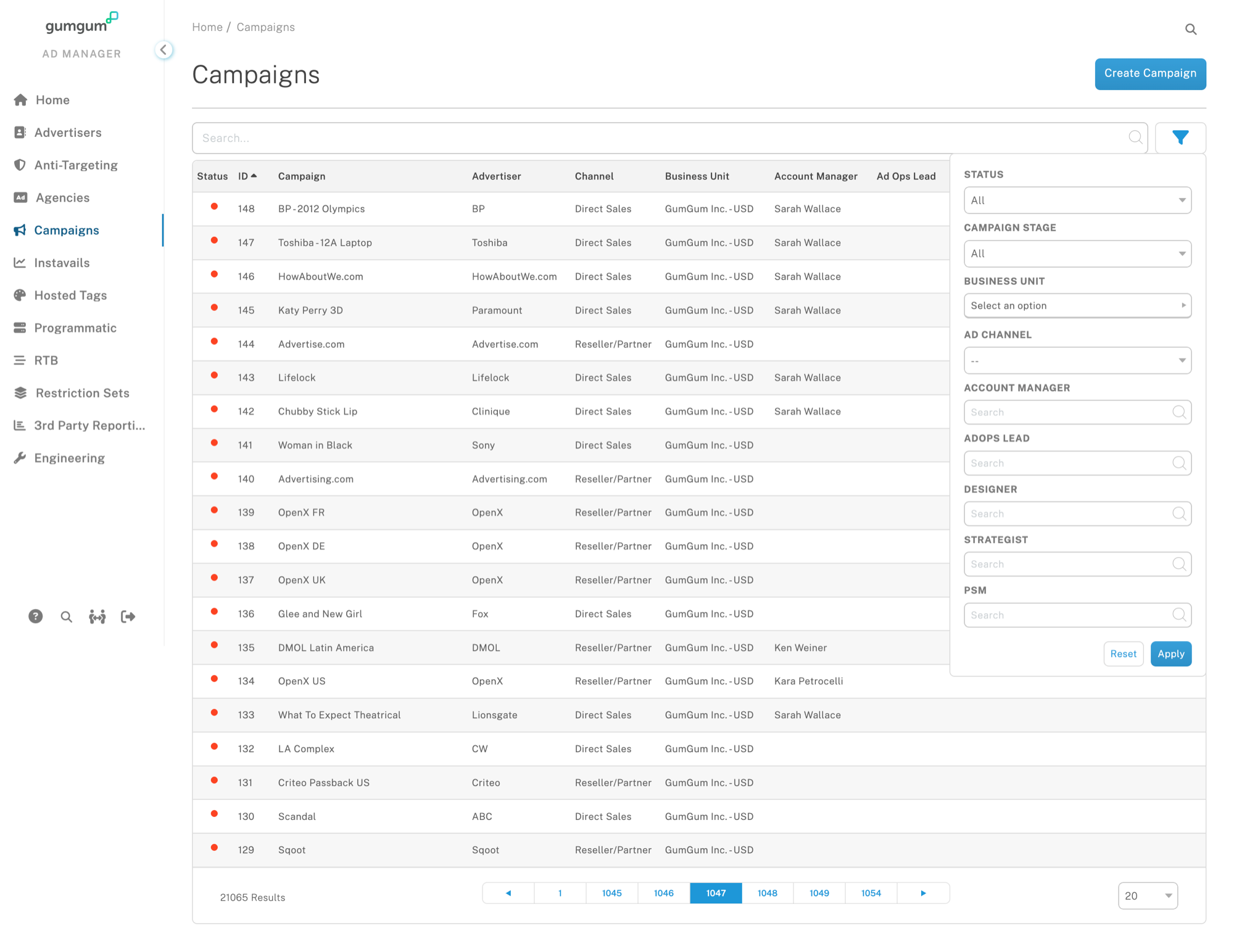
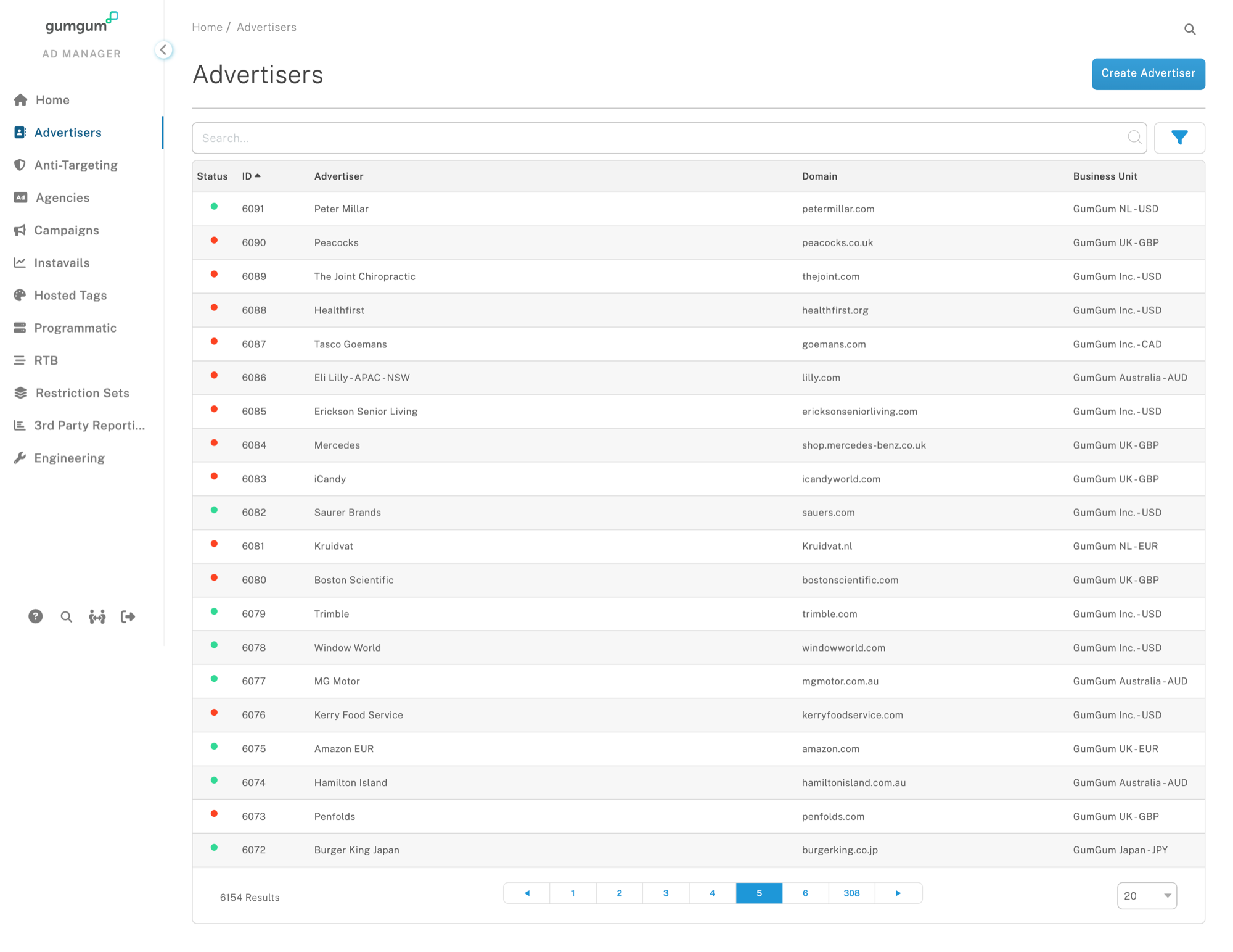
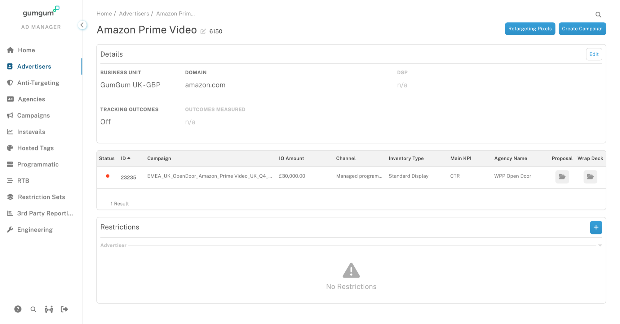
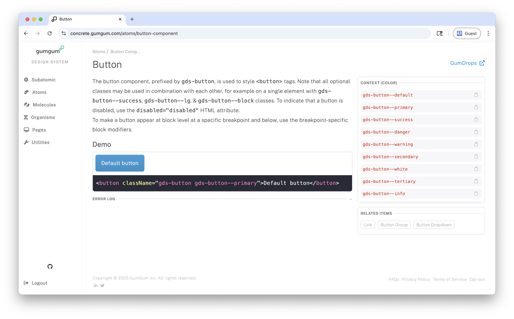
We simplified workflows, consolidated UI patterns, standardized tables, reduced unnecessary UI states, and unified brand theming from six themes to one canonical theme.
The Results
Removed redundant steps. Reduced copy/paste tasks. Improved hierarchy. Reduced cognitive load. Impact: Reduced need for operational headcount.
Merged overlapping configurations. Standardized table behaviors. Unified filtering logic. Reduced duplicate data entry points. Impact: Reduced duplication and cleaner logic.
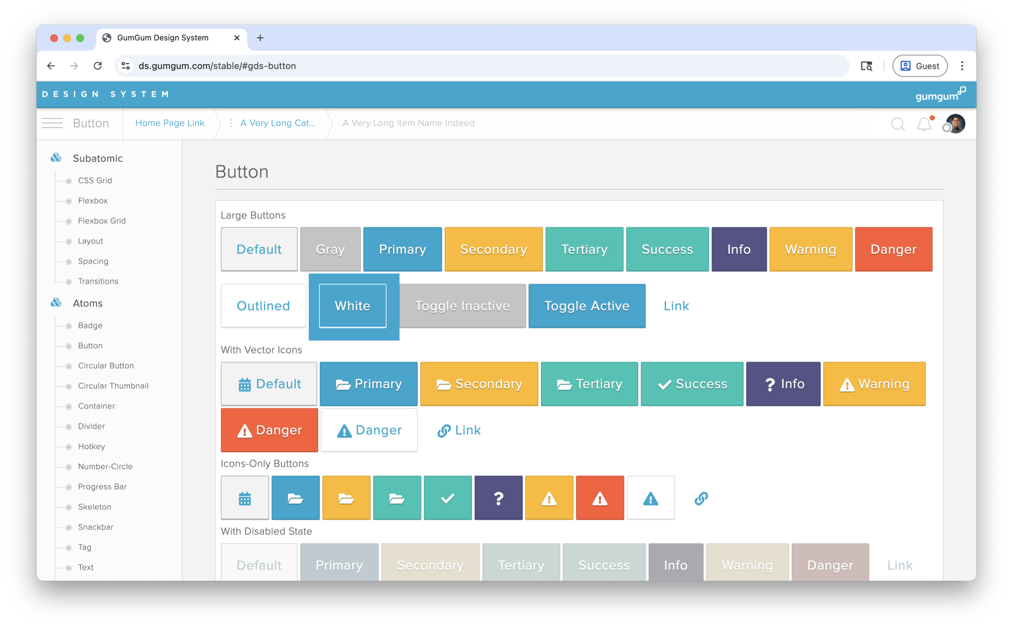
Rebrand executed. Reduced from 6 themes to 1. Improved consistency. Improved accessibility. Simplified maintenance burden. Impact: Lower long-term system complexity.
The rebuild reduced waste at both the human and system level: fewer API calls, less data duplication, less redundant manual work, faster onboarding, and a design system (Concrete 2.0) that six applications could adopt without reinterpreting it.